Our Role
Lead Product Designer
UI/UX Design
Task
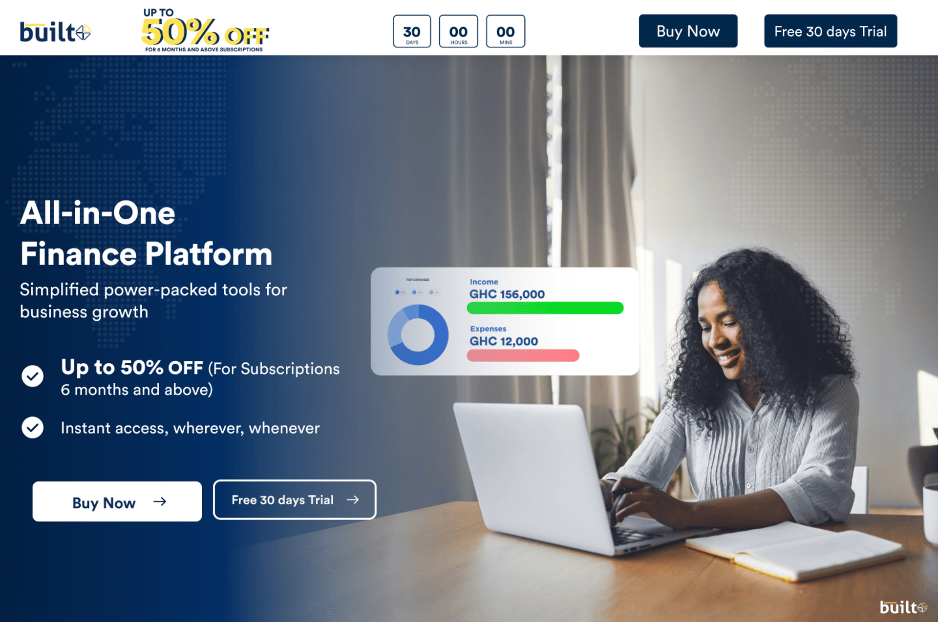
We designed a promotional landing page for Built’s limited-time 50% discount campaign. The experience needed to explain the offer clearly, present persuasive visuals, and guide visitors toward a simple sign-up or subscription flow.
Responsibilities
- Wire framing
- Visual Design
- User Interface Design
- User Experience Design
- Micro interactions Design
- High Fidelity Prototyping
- Interaction Design
Tools


Project Duration
1 Week
Problem statement
Potential users may miss a limited-time discount when campaign visibility is low or offer details are unclear. That uncertainty can reduce engagement and prevent people from acting.
A dedicated landing page was needed to make the value, terms, and next step easy to understand while building confidence in the sign-up process.
Solutions
Lead with the offer
Give the 50% discount a clear place in the page hierarchy.
Explain the value
Communicate the offer and its benefits in direct, easy-to-scan language.
Reduce sign-up friction
Keep the route from exploring the offer to subscribing straightforward.
Clear calls to action
Make the next step visible and use urgency thoughtfully.
Responsive layout
Make the campaign accessible across mobile and desktop screens.
Measure engagement
Support analytics so campaign interactions can inform optimization.
Design process
We shaped the campaign around the offer, audience questions, and a short conversion path.
Research
Understand campaign goals and audience needs.
Structure
Organize the offer, proof points, and page flow.
Visual design
Build a strong hierarchy around the promotion.
Prototype
Connect the landing page and sign-up actions.
Refine
Review the experience across device sizes.
Empathy map
The campaign experience considered what prospective users need to know before committing to the offer.
Thinks
“Does the discount apply to the plan I need?”
“Will I still get the full service?”
Says
“I need clear information on how to redeem the offer.”
“I’ll sign up if the process is straightforward.”
Does
Visits the campaign page to review pricing and offer details.
May return later to complete sign-up.
Feels
Motivated by the savings but cautious about unclear terms.
More confident when the page feels transparent and trustworthy.
Pain points
Unclear promo details
Users may not understand eligibility, duration, or what the discount covers.
Complex sign-up
Long or confusing registration steps can prevent completion.
Trust concerns
Missing reassurance or transparent information can create doubt.
User personas
Ama Boateng Startup Owner · Age 29
Accra, Ghana · Founder of a small fashion brand
Goals & motivations
- Get an affordable professional website to improve visibility and sales.
- Use the promotion to access better value and build business credibility.
Frustrations
- High design costs and missed deadlines.
- Technical jargon makes service pages hard to understand.
Kofi Mensah Freelance Marketer · Age 34
Kumasi, Ghana · Digital marketer and freelancer
Goals & motivations
- Find affordable, dependable design support for client websites.
- Use the promotion to assess service quality before a longer partnership.
Frustrations
- Promotional sites often omit scope or quality information.
- It is hard to find responsive teams that deliver on time.
Style guide
Circular Std
A clear, confident campaign for Built’s limited-time offer.
Landing page screens


Prototyping

Custom components


